There are as many ways organizations can create, store, move and retrieve data as there are ways to see, perceive and interpret it
As we progress into 2020, a milestone year for prognosticators of years past and present-day futurists, the state of data visualization continues to evolve, as expected. In 2020, there are as many ways organizations can create, store, move and retrieve data as there are ways to see, perceive and interpret it.
Currently, there are three growing trends in data visualization, including:
- Increased cloud connectivity
- Integrated predictive maintenance and connected field service
- Diversified user interfaces (UI).
Seeing further through the cloud
Many organizations already have realized the value of adopting a cloud-based data platform. Among these benefits are increased scalability (due to growing cloud platforms such as Microsoft Azure), reduced onsite hardware obsolescence and expanded connectivity due to the ability to use open standards such as OPC UA, BACnet, SNMP, Modbus, web services and/or classic OPC tunneling, as well the ability to ensure secure communications via a combination of AMQP, MQTT, REST, WebSockets and TLS encryption with x.509 certificates.
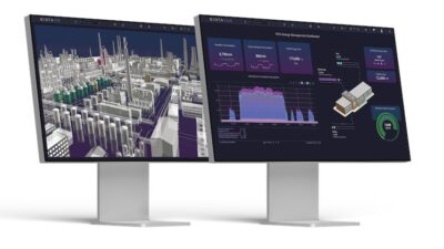
For data visualization specifically, cloud connectivity can provide the cost-effective “heavy lifting” of processor-intensive analytics, compared to onsite alternatives, so users are able to visualize larger amounts of data from multiple sources to help expedite decision making (see Figure 1). Additional integrated tools, such as those geared toward business intelligence (BI), help provide a cohesive view of an organization’s entire data system, since such systems can be diverse, comprised of multiple components and may use their own data storage and interfaces for access to stored data (e.g., web services, databases, historians, etc.). Analytics/BI tools help to correlate multiple datasets while allowing for queries via a common set of filters and/or parameters. Through these tools, the collected data can then be visualized in a normalized way, providing logical “shaping” and better grounds for comparison for end users.
There are many applications and associated industries for cloud-connected data visualization (see Figure 2). One scenario is the global manufacturing enterprise, where multiple geographically dispersed facilities can provide their data to a centralized visualization tool via the Industrial Internet of Things (IIoT).
Another scenario is for a company visualizing its energy management efforts, which could include the costs, consumption rates and carbon emissions for a single building up to an entire campus. Any organization gathering large amounts of data from multiple sources in multiple locations can benefit from the latest cloud-based visualization tools.
Maintaining control/controlling maintenance
Predictive maintenance is a growing application for data visualization, where organizations wish to switch over from the legacy break-fix model to one that is more efficient, proactive and cost-effective. Some related software solutions use fault detection and diagnostics (FDD) technology — a form of analytics particularly valuable to operations and maintenance teams (see Figure 3). FDD technology incorporates a standard library of fault rules that can be customized to predict equipment failures and advise personnel of preventive actions. This type of info (symptoms, causes and recommended actions) may have only previously existed for some organizations in the memory of senior personnel or, in some instances, in print or noninteractive electronic archives.
FDD tools use an advanced fault rules engine that calculates fault probability as well as associated costs. It saves users configuration time by making integration easier, faster and more intuitive. The tools integrate easily with an organization’s multiple data systems, including popular building automation system (BAS), supervisory control and data acquisition (SCADA), programmable logic controllers (PLCs) and others used to monitor equipment conditions. Through FDD tools, associated alerts can be visualized in creative and intuitive ways to assist maintenance personnel in their daily tasks. Users also can create reports and charts to help visualize operations and address equipment performance inefficiencies.
An additional tool that can be integrated with visualization and predictive maintenance tools involves an organization’s connected field service (CFS) operations. This contains advanced abilities that help streamline efficiency of field service organizations through intelligent scheduling and reliable notifications (see Figure 4). The dedicated software can be tied to the same alarms and faults recognized by the FDD system. It also provides a prebuilt operator or dispatcher dashboard, offering an overview of all the current alerts and who is responding to them.
The CFS uses intelligent algorithms and customizable weighted scoring to determine which field worker is best for a specific maintenance task, then sends a notification to that worker’s mobile device for immediate action. The fully customizable workflow can use factors such as workers’ schedules and current GPS location to determine the best technician for the task.
Alerts can be delivered via email, SMS or through an integrated mobile human-machine interface (HMI) app via push notification. When the technician receives the alert, he or she can reply to the message or use the mobile app to either accept responsibility, reject the alert or report as “busy,” (which passes the alert on to the next selected qualified worker).
Another useful aspect of CFS software is its integration with popular enterprise resource planning (ERP), customer relationship management (CRM), computerized maintenance management system (CMMS) and directory services such as Microsoft Dynamics 365. This allows for retrieval of information such as worker contact info and scheduled availability from those connected systems.
Diversified UI
Another major trend in data visualization is how organizations are taking a closer look at the relationship between the types of data they generate and how they are best presented to their employees/users/customers. Advances in technology have resulted in multiple different ways data can be accessed, viewed and even acted upon. Of course, desktop and laptop PCs are still predominantly used, both in interface development and final displays. However, PC-based visualization also has evolved, where traditional 2D graphics have been joined by more immersive, interactive 3D and mixed reality (MR) options.
More mobile options, including tablets and smartphones, also have been adopted by organizations worldwide. Today’s modern HMI authoring tools allow for “design once, deploy everywhere” functionality. Such responsive design allows for displays to be rolled out to multiple device types, with multiple different screen sizes and resolutions, helping to ensure a more cohesive, standardized look and feel. Also, as the number of mobile device types increased, so did connectivity options and speeds, so that users in the field could experience the same rich, rapid visualization, monitoring and control.
The evolution of data visualization has resulted in more interesting forms. Some organizations realized the need for presenting data to an operator where he or she might not have both hands free to use a laptop, tablet or smartphone. Microsoft, known for the operating systems and productivity software it pioneered for more traditional devices, created the HoloLens self-contained holographic computing device to meet this need (see Figure 5).
Now updated to HoloLens 2, this MR device provides an augmented view where data can be visualized within an operator’s field of vision. Recognizing the need for a hands-free, rugged wearable device, RealWear, of Vancouver, Wash., developed the HMT-1. The company’s aim is to allow workers “to maintain full situational awareness and maximum productivity.”
Just as when they recognized and adapted to tablets and smartphones joining their customers’ desktops and laptops, automation software vendors found a development opportunity in wearable computing devices. The concept of a “holographic machine interface” emerged, where a user would be able to quickly view information on the piece of equipment they were currently looking at. For example, a technician could walk up to a machine in a factory and be able to see a 3D schematic of its internal components. Through a voice request, the same technician also could see related product documentation and specifications, or a video on how to replace a specific component, or real-time operational values. The combination of certain devices and software can provide a “remote expert mode,” where the onsite technician can provide a live view of what he or she is looking at to another technician, who may be located elsewhere, who has more experience with the task at hand and can remotely lend his or her expertise.
Speaking of the task at hand, data visualization has also reached smartwatches. Apple released its Apple Watch line, while multiple other manufacturers created smartwatches that use a variant of the Android OS called Wear OS. All are minicomputers meant for the wrist, boasting considerable processing abilities and are prime for data visualization capabilities. Automation software vendors have found the perfect combination of “at a glance” quick info delivery of role based key performance indicators (KPIs), especially for those smartwatches paired with multiple means of connectivity (cellular, wi-fi, etc.). When connected, important data metrics can be viewed in an instant straight from a user’s preferred wearable device (see Figure 6).
Although not considered traditional visualization, voice assistants such as those developed by companies like Microsoft (Cortana), Google (Google Assistant) and Amazon (Alexa) can provide results to spoken inquiries and even trigger actions for connected devices (e.g., turning lights on and off, locking and unlocking doors, etc.).
The same concept applies for using voice-commanded assistants within industrial or building automation (see Figure 7). Automation software vendors have created voice machine interfaces, where the types of queries are like what would be made graphically via traditional HMIs on digital displays.
For plant/operations managers, one could ask Cortana, for example, “Hey Cortana. What is the OEE [overall equipment effectiveness] for line one, and how does it compare to last shift?” and be met with the voice response of “The OEE for line one is 78%, which is up 2% from yesterday.”
For facility maintenance personnel, one could ask Alexa, for example, “Alexa. What is the current voltage of this chiller compressor?” and the reply could be “The current voltage of this compressor is 200 V at 50 Hz.”
For organizational management, one could query the Google Assistant with, “Okay Google. What is our total oil production year-to-date, and how does it compare to last year?” and the response could be, “You have produced 5,640,000 barrels of oil year-to-date. That is up 4% from last year.”
Looking into the future of visualization
This article covers a few of the growing data visualization trends, including increased IIoT integration, closing the loop in predictive maintenance and field service notifications and increasing an organization’s user interface options.
What will the future of data visualization look like? It may involve new, more sophisticated connectivity methods to complement the IIoT, or integrating artificial intelligence (AI) or collaborative robots into predictive maintenance and field service. It will involve the expansion of user interfaces, as the form and utility of connected devices, as well as the underlying software, is guaranteed to evolve.
This article appears in the Applied Automation supplement for Control Engineering and Plant Engineering.
Melissa Topp is senior director of global marketing at ICONICS, developer of the GENESIS64 HMI/SCADA automation suite.


